When the prompt becomes a creative brief
Writing a prompt that yields a specific image is closer to art direction than to drawing. But there are legal and ethical considerations, too.
See that snazzy image up there? There's a prompt at the bottom of every post on this blog, describing how it was generated.
The prompt is there as evidence: the image exists, and this is how it was made. It was supposed to be a simple thing, but then I fell into the rabbit-hole of prompting images as a discipline in itself. Hoo-boy.
I've started using Midjourney (opens in a new window) to create images, after initial experiments with Gemini and ChatGPT. Those tools genuinely make image generation feel easy, which is the point of them — you describe a thing in plain words and something arrives.
For a while that was enough. But I was hankering for things like finer control over composition, higher resolution, and the ability to refine an image rather than reroll it. But I kept hitting the soft ceilings those tools put on output and usage.
Therefore, a switch to Midjourney would entail boundless vistas of creative freedom, right? Right...?
The one-armed bandit
Not going to sugarcoat it, my first few sessions with Midjourney were terrible.
The tool gives you four images per prompt and invites you to click the nearest one to refine it — a loop that feels uncannily like a slot machine, pulling the lever and watching three near-misses and one definitely maybe scroll past. But there's a cost to how often you spin the wheel.
My account has a quota of "Fast Hours", or time you can spend using high-end GPUs in the cloud to generate your images. The clock is running, quite literally, and I burned through my fast hours chasing images that were almost-but-not-quite by clutching at whichever lever was within reach. More fool me for not consulting their documentation (opens in a new window) before diving in.
There's also a parallel economy of free hours, where you can earn extra GPU time by completing tasks on Midjourney's site — curating the Explore page, or answering the occasional survey where you "share thoughts to help us explore the intersection of personality and aesthetics".
There's something surreal about being asked to grade your feelings on organised religion or the environment in exchange for compute. I'm genuinely curious how this informs the development of their models. But the extra hours are welcome!
Image prompting 101
After wasting enough time, I decided to treat the prompts the way I'd treated this blog's code: bringing them into a conversation with Claude. And then the prompt became something like a creative brief.
A flow would go something like "here's what I tried, here's what came back, here's what I was after".
Often the useful part wasn't a finished prompt but an explanation of what the model was probably responding to. Alternatively, why a clause I assumed was shaping the picture turned out to be contributing diddly squat.
Some observations:
Order matters. Midjourney weights the front of a prompt more heavily, so sequencing your idea is important. Lead with medium and framing, then the subject, then the setting, then a small set of style anchors, then parameters. "Editorial illustration, top-down overhead view of a blueprint on a kitchen table" sets up a different image from the same nouns rearranged.
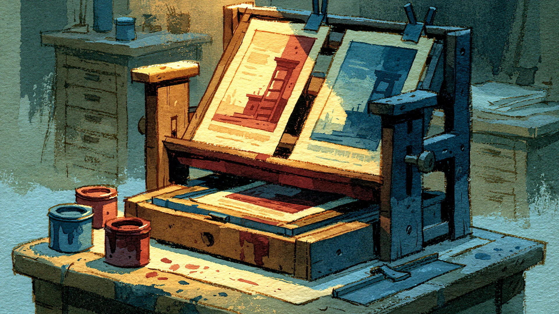
Detail is fine when it's directed. The prompts on this site are long — a paragraph or more. One of them places a coffee mug to the right of a blueprint, a half-eaten croissant in the upper-left corner, a shaft of light coming in from the upper left. The length isn't a problem so long as you stay focused. Every clause in a good prompt is placing something, lighting something, or ruling something out.
The end of the prompt is where you fight the model. The
--noparameter is a feature I leaned on a fair bit. Midjourney has predictable failure modes, and the tail of the prompt is where you name them so they don't appear — deformed hands, stray text, an object somewhere it shouldn't be.There's a taste dial. Stylisation with the
--sparameter governs how much the model leans on its own aesthetic sense versus your literal words. Higher values tend to suit editorial illustration, where you want the result to feel composed rather than transcribed. Mine sits around--s 350.
The bones of a decent prompt, as a single shape: medium and framing → subject → setting → two or three style anchors → parameters, ending with a --no list aimed at the model's known weaknesses. Everything you see on this site is some version of that.
The style, for now
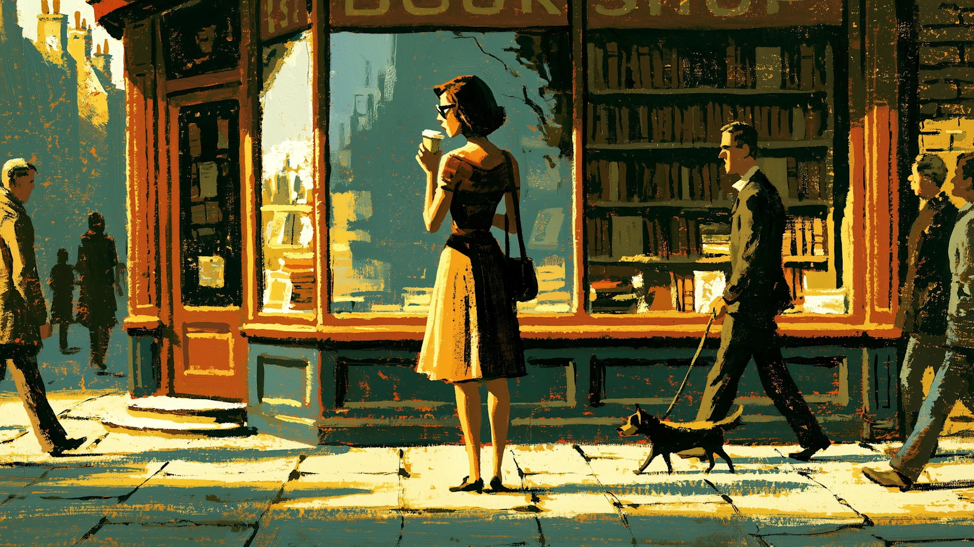
The covers share a register: gouache, muted earth tones, warm directional light, that --s 350. I didn't set out to design a house style. I found something that worked on one image, and carried it over to the rest.
This mode isn't a permanent fixture. Rather, it's what I like at the moment. Editorial illustration of more or less any era reads as a deliberate choice to me, whereas photorealism tips into stock-image slop and the default cartoon look says nothing at all.
Reading the small print
Let's cover off the legal and ethical considerations. The guidance is there, but the onus is really on you to go and read around the subject.
The broad picture: most mainstream image generators place the liability for what you make squarely on you. That means you have to be careful you don't accidentally stray into IP infringement and breaches of copyright.
(The terms vary, and a couple of platforms market themselves on being trained from licensed material and offering some form of commercial protection. But the details differ enough that I'd point anyone to the actual terms of whatever they're using (opens in a new window) rather than take my word for it.)
The point is this: Just because "the tool let me make it", don't kid yourself into thinking that "I'm clear to use it however I like."
With style you're on more solid ground. Style itself isn't copyrightable, and there's a big difference between drawing on a broad tradition and pointing the model at one specific living artist's voice — the law is clearer than the ethics there.
I've come down on the side of the broad and the general: periods, movements, genres. It's a better creative discipline anyway, because it makes you articulate what you actually respond to in a thing instead of borrowing the shortcut of a name, brand or trademark.
The honest position is that I don't know what I don't know, but blissful ignorance is no defence. Reading around the subject has shown me the contours of a boundary and how to stay within them.
Boundless vistas (with caveats)
Writing a prompt that yields a specific image is closer to art direction than to drawing.
You're not making the picture; you're writing the brief the picture comes from, and the quality of the brief sets the ceiling on the result. That's true of art direction in the ordinary sense too — the director who can't draw still shapes what gets drawn.
But there are also constraints to consider, whether that's the sophistication of the tools you're using or respect for other people's work. That's why the prompt sits at the bottom of every post, because it feels like the intellectually honest thing to do while using a technology that's still evolving.