Kinds of blue: Design tokens for contrast and accessibility

I woke up today and decided to change the header colour from crimson to blue. Let's talk about design tokens, contrast and accessibility.
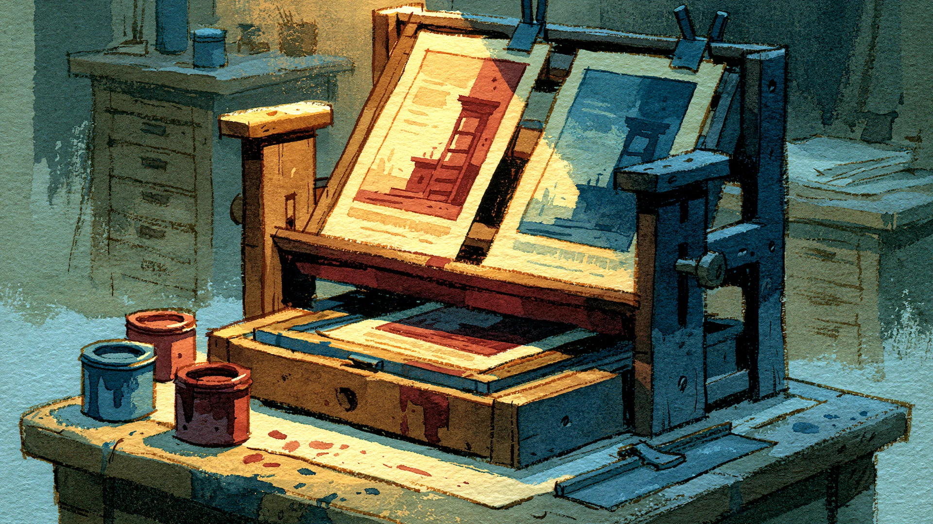
Yesterday, the header of this site was a shade of crimson. Today, I decided to change it to a shade of blue. Tomorrow it might be something else. A shade of green, perhaps?
Thanks to a basic implementation of design tokens on this site, making a change like that should be trivially easy.
But pretty colours don't necessarily equate to a legible design. There are also factors like contrast and accessibility to account for.
Let's fall down a rabbit-hole, shall we?
A token is a named decision
A design token is a name you attach to a design value, like a colour, a spacing or a font size. Instead of repeating those values everywhere they're used, you can give them a unique name and then point your code towards it.
The convenience is that the value lives in one place, in one file. Change it there and every reference updates.
Take my brand red. It's not scattered through the code as forty copies of #A4243B. It lives once, in a file called globals.css, under the name --color-brand-crimson.
@theme {
  --color-brand-crimson: #A4243B;
  --color-brand-dark: #241B1D;
  --color-brand-bg: #FAF5F1;
}
Every link, every section eyebrow, every hover state, and (until now) the header bar, all referred to that name rather than the raw value.
The name carries intent as well. It records that this is the brand colour, not merely a red I happened to like on a Tuesday.
So in theory, changing the brand red should be a single edit. That's the whole pitch for design tokens, and most of this change really was that simple.
Actually, I tell a lie, it wasn't.
When a token has two jobs
When scoping out the change with my good buddy Claude, I learned that my crimson token was wearing too many hats.
It coloured the header bar, but it also coloured the body accents, the links, eyebrows and hovers. Both jobs required the same red, which blocked me from applying more granular revisions.
In other words, a blue header with crimson links needs the header colour and the accent colour to be two separate decisions. One name cannot hold both.
So we split it. A new token, --color-brand-header, holds the header decision on its own, and --color-brand-crimson goes back to meaning only the accent.
@theme {
  --color-brand-crimson: #A4243B;
  --color-brand-header: #1E3A8A;
  --color-brand-dark: #241B1D;
  --color-brand-bg: #FAF5F1;
}
So, today's slice of wisdom. If you anticipate that two values might diverge at some point in the future, give them separate names now, even while they share a value. Got all that? Good.
Where the single source leaked
The tidy version of this post would stop there. One token split into two, a single source of truth restored. But the truth is a little messier.
The header colour doesn't only live in CSS. It also appears in two places written in JavaScript: the tint that mobile browsers paint behind the address bar, and the theme colour in the web app manifest. Neither of those can read a CSS token.
So my one source of truth is honestly two. A CSS token and a matching JavaScript constant, the same hex written in both worlds, kept in step by hand with a comment pointing each at the other.
export const BRAND_HEADER_COLOR = "#1E3A8A";Tokens are tremendously useful because they reduce duplication. But alas, they don't remove it completely. Better to share that upfront than pretend the colour ended up in a single home (because it didn't).
How I picked the blue, and why contrast decided most of it
Now we come to the fun part. The exact shade of blue wasn't chosen at random. Contrast did the early filtering, and it's worth a short detour into what that means.
Contrast ratio is a single number comparing the brightness of text against the brightness of what sits behind it. It runs from 1:1, where text and background are identical and the text is invisible, up to 21:1, which is pure black on pure white.
The higher the number, the easier the text is to read, and the more people with low vision can read it at all. The web has an agreed standard for how high that number needs to be. It is called WCAG, the Web Content Accessibility Guidelines, and it sets levels.
The middle level, AA, is what most sites aim for and what accessibility tools flag against. AA asks for at least 4.5:1 for normal body text, and 3:1 for large text such as a heading. The stricter level, AAA, asks for 7:1. When you see AA in a design discussion, that's the 4.5:1 threshold being talked about.
My header bar carries white text, so the only question was whether white stays readable on the fill.
Royal blue, the brightest candidate, came in at around 4.5:1 against white. The bold title clears the large text bar comfortably, but the small tagline beside it only just scrapes the AA line for normal text, and any future tweak to the shade could push it under. The darker blues cleared 8:1 and higher, past AAA, with no such worry.
That ruled out the bright option on a measurable basis. Once three darker blues all passed, though, the numbers had nothing left to say, and the final choice was taste.
Tailwind blue-800 didn't make the cut because it's the default blue that ships with the framework this site is built on, and to anyone who knows the palette it reads a little generic, the visual equivalent of leaving the stock font in place. blue-900 keeps the royal character without that tell.
And so the header is now blue. Hurrah! The net result was a tidier set of names for my colours, and a sharper sense of where a token can follow a value and where it stops.
Check back tomorrow, when the header will be a snazzy shade of green. Maybe.